Casestudy - RMV Public Transportation App
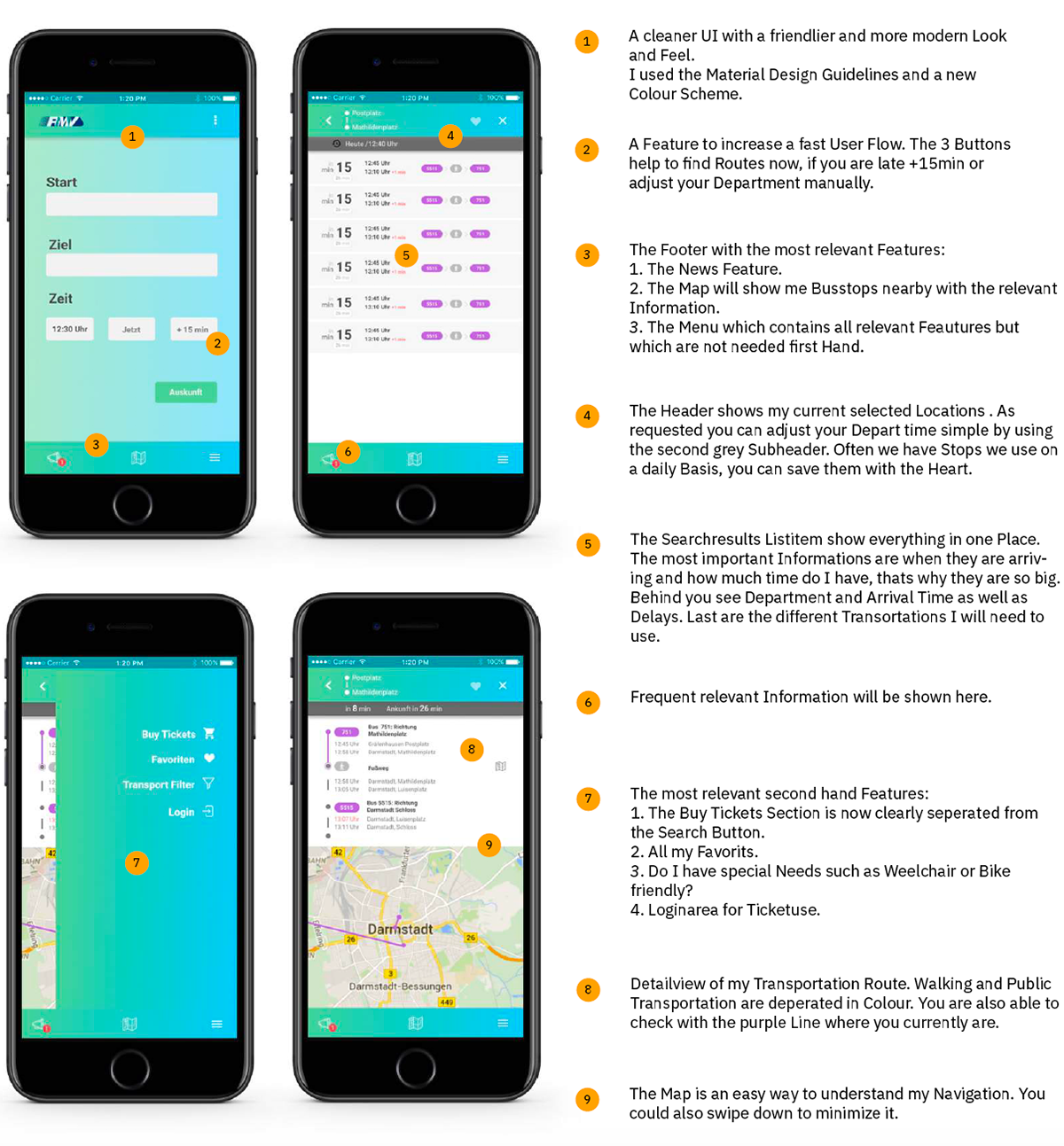
The overall User Experience was challenged and improved with a lighter more accessible UI.
Objective
Improved Information Overview
Friendly and light UI
Everything important on one Screen
Role
User Research, UX/ UI Design, Interactions
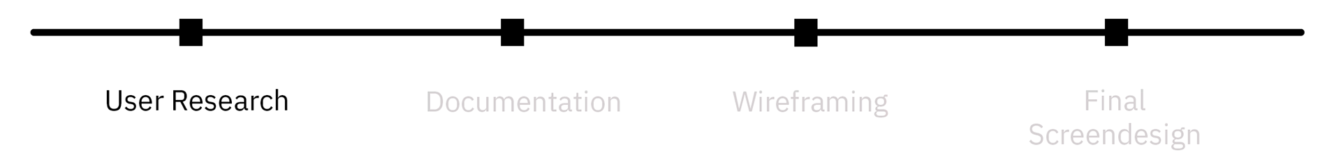
User Research
Value: Understand the Problems and hidden Needs of the Client and User.
Through my personal experience with the App I already knew from first hand what I would like to improve. But I did a Desk Research Deep Dive into the User Feedbacks from the App Store.
I was really happy to find a lot of useful Information about the User Behaviour and Problems. I could have done also further Research like Interviews but in this Case I got enough quality Information out of the Reviews.
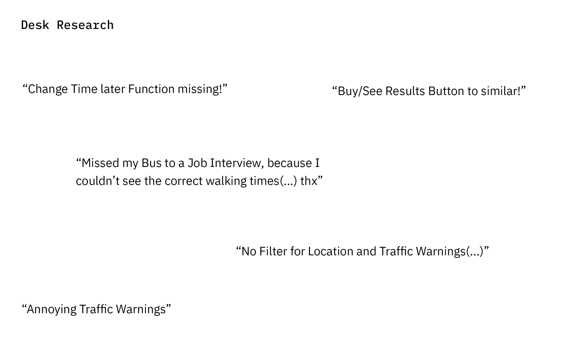
RMV and their terrible mobile Interface
With bad Information Hierarchy and confusing buttons. It is a vital part of a transportation app to acess information quickly and organised.

Old UI: Confusing Buttons
Old UI: Bad Information Hierarchy
Old UI: Cluttered Ticketing System
Documentation
Value: Clarify the what, who, where, how, when and why. Prioritise functionalities and create a hierarchy of Information.
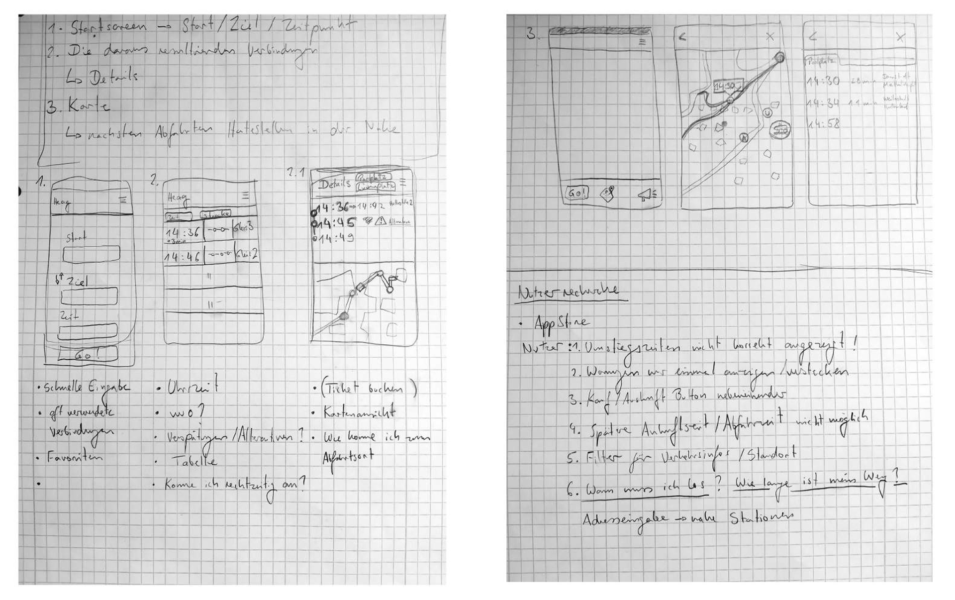
Through it was a personal Project I did it all in handwriting. I did take notes where I was unclear and try to make first sketches based on the Research i did.
This helps me to see the overall picture but also work out details which I would try out later. I didn’t want to change the entire Appdesign. I included the basic structure and left the important Action Buttons where they are.
In case my Redesign would be implemented it would be easier for the User to Step by Step change the Design.
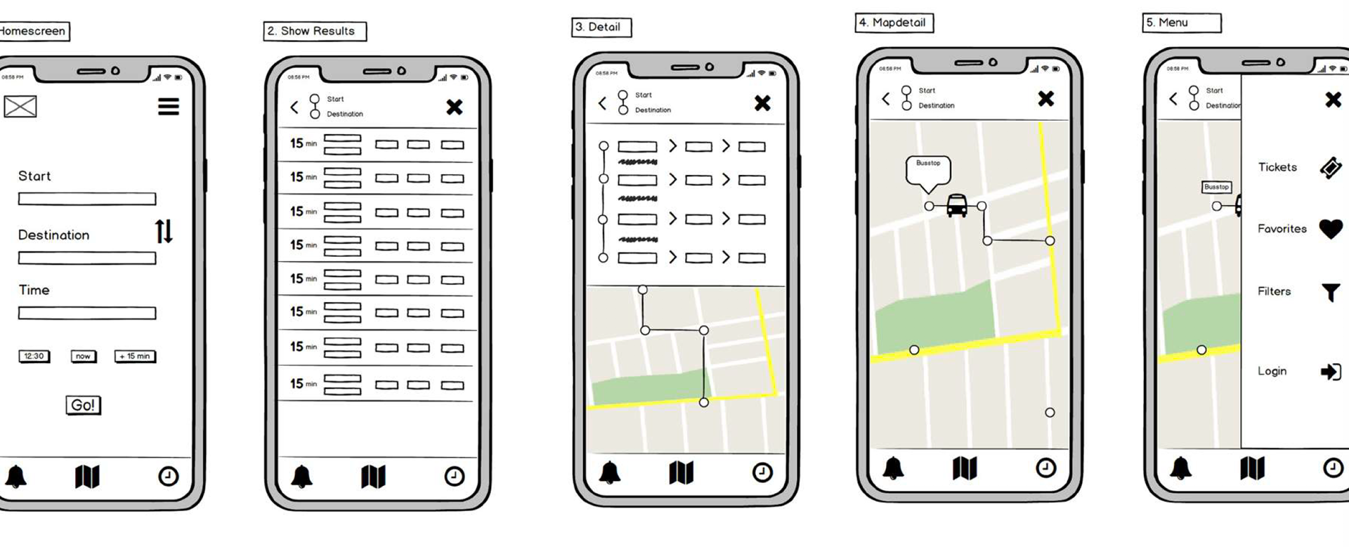
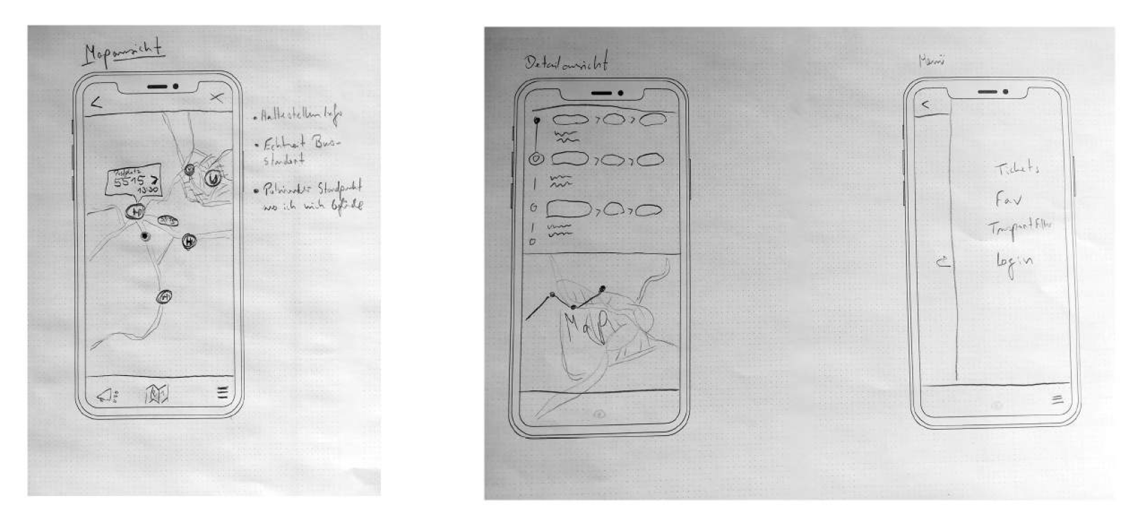
Wireframing
Value: To quickly test and iterate Use Szenarios.
I used the Wireframing Tool Balasamiq and Pen and Paper to try out different Layout options for the new Home and Search Screens. One Idea was to Realtime Monitor, where the Bus is at the Mapdetail. This would allow the User to never get lost. I also wanted the least amount of clicks needed to see all my possiblities to travel.
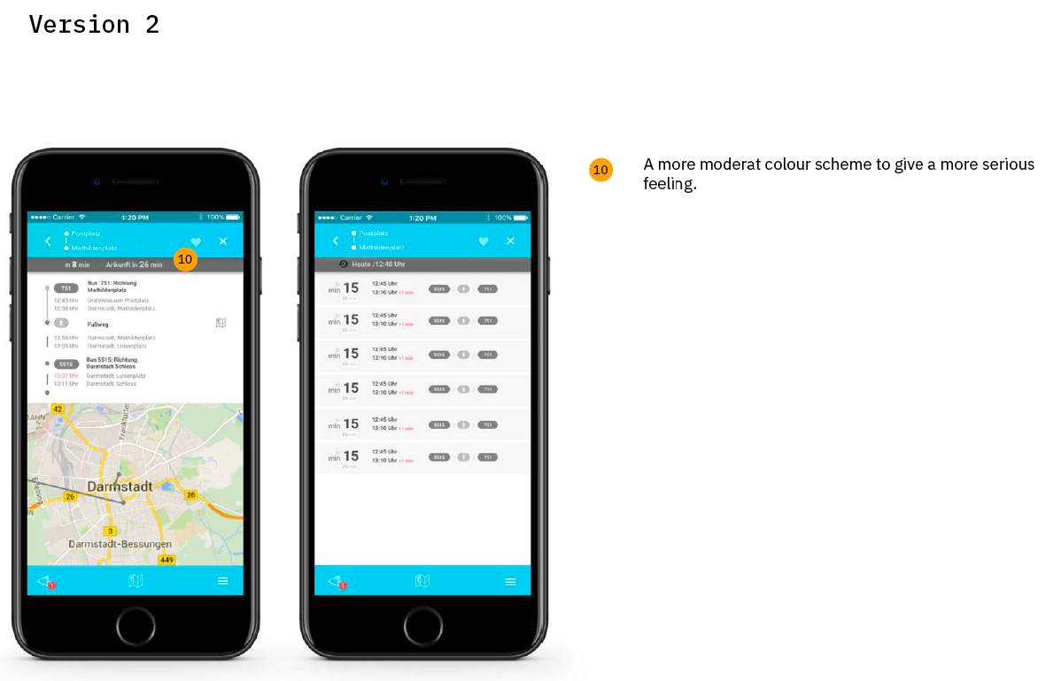
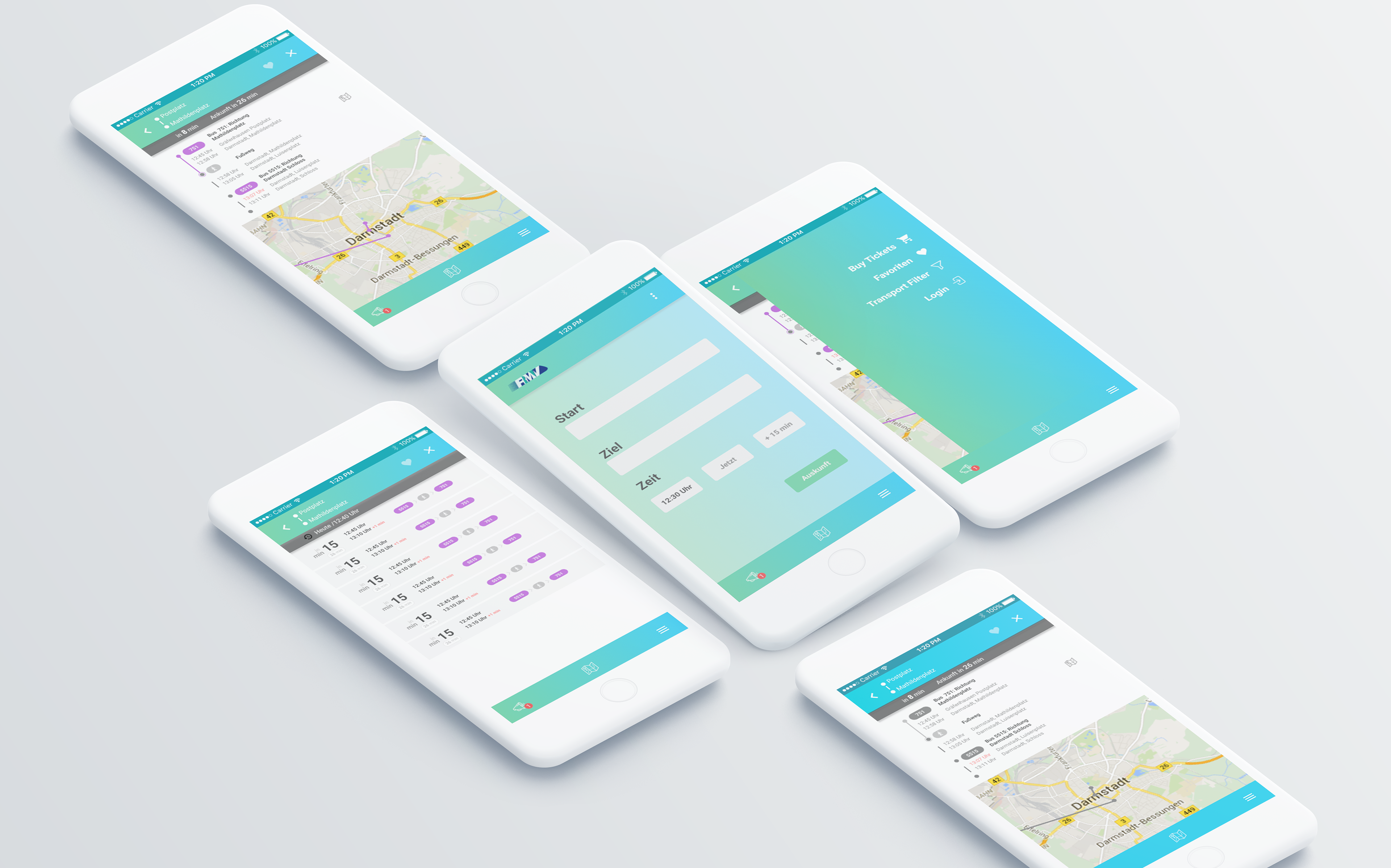
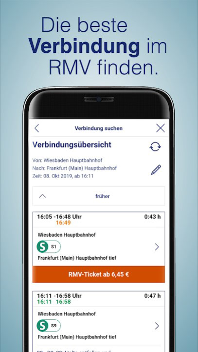
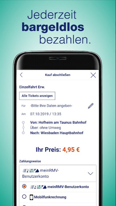
Final Screendesign
Value: Create the final UI Solution based of all previous observations. Use Typography and Colour to create a visual pleasing End Result.
Thoughts to the final Screendesigns are explained below. To challenge the presented UI solution I created two different colour Schemes, which serve different User preferences and could be disscused easier.